@SFMOMA
On an earlier visit to San Francisco, I visited the Museum of African Diaspora (MoAD). This time, my cultural education took me to San Francisco Museum of Modern Art (SFMOMA). It has got to be the biggest museum of modern art that I've visited; the Salar Jung Museum in Hyderabad came second. For my SFMOMA trip, I was with Hanna and Dede; they were both in UC Berkeley this summer for a short course.
 |
| Dede and Hanna amidst Sol LeWitt's Wall Drawing |
SFMOMA has seven floors filled with artwork made mostly in 1860–1970 (the modern art period). I have always found appreciating the pieces from this period challenging and I'm happy that I wasn't alone. Hanna and Didi were on the same boat. But that did not stop us from enjoying our visit to the museum.

After all, aside from seeing artwork, we also had good views of San Francisco's skyscrapers. From an upper floor, we could clearly see the Salesforce Building (currently the city's tallest) towering over the city. From another window, we had a great view of 181 Fremont (currently housing Facebook and Instagram).

After turning our backs towards the windows, it's time to delve into the actual artworks. There were several exhibits and we started from the seventh floor, working our way down.
We first checked out Nothing Stable Under Heaven, an exhibit that wished to convey that the past was contested, the present is turbulent, and the future is unpredictable. It wanted to show "how individual and collective voices can be heard in an uncertain world". The theme was, in my opinion, kind of pessimistic; the way I saw the art confirmed this overall tone. For instance, a piece consisted of a dot matrix printer continuously printing news on a very long sheet of paper. The audience could, if they wanted to, tear off an article from the every growing pile of news. I suppose the artist wanted the audience to be aware of history unraveling around them.
 |
| Hans Haacke's News |
Around this printer were black-and-white photos of a rally that happened in Brasilia. People crowded the area where the different government ministries were located. It showed the contrast of a well-laid out city (uniform building architecture conveying order and sterility) with the chaos brought in by the crowd (showing life and drama).
Then there was a video juxtaposing the successes of African-Americans celebrities (in their respective fields) with the dangers experienced by poorer African-Americans. There were images of children being gunned down, mothers being separated from their children, teenagers being taken down with force. At the same time, there were basketball players shooting, singers performing onstage, and tennis players celebrating their victories. From the way I understand it, the film was an expression of inequality happening even after the Civil Rights Movement. It reminded me of After the Thrill was Gone in MoAD, but that's about the post-apartheid era in South Africa.

We were rightly warned about the graphic nature of the video. It was certainly difficult to watch. The film (I think) is an example of Moment Work, a technique where non-consecutive or unrelated episodes (or "moments") were featured rather than "scenes" that linearly led towards a climax and then to a conclusion. The artist definitely had a story to tell because each splice of documentary did not show why the children were in the middle of a shoot out, why the mother was being separated from her children, or what the teenagers were doing before they were forcibly pinned to the ground. And the celebrities? The artist did not show the struggles that the celebrities went through or what they gave up to be where they are right now. Yes, the situation is unstable, but surely there is hope.
On the other hand, Sublime Seas was an exhibit featuring John Akomfrah's Vertigo Sea, three screens filled with beautiful imagery of marine life. Whales were swimming joyfully around icebergs and fish were flitting about under the sea. Then came the men aboard ships, hunting the whales with harpoons. These clips were interspersed with depictions of the transatlantic slave trade. Was the artist using whale hunting as a metaphor for colonialism? Like the previous exhibit, Sublime Seas was disconcerting. Because I didn't finish the film, I didn't learn if there is catharsis at the end of the bloodied ocean.
My favourite installation is called Tilted Plane by Jim Campbell. From the hopelessness of the previous exhibits, I needed to see something more lighthearted. Tilted Plane was basically a blacked out room bedecked with custom-made light bulbs hanging from a grid at different heights, giving audiences a sense that the room was tilted. I felt like I stepped into a zoomed in low-resolution digital photo (where we see the dots on the photos). It was a fascinating piece of work! Too bad we weren't allowed to take photos inside.
Then there's Donald Judd's Specific Furniture, an exhibit featuring furniture as artwork. We were not allowed to sit on the chairs in the exhibit but we were allowed to use the furniture (by the same artist) outside the gallery. I am not much of an internal decorator; for me, these were just regular chairs and tables... a bit cold; not homey at all. But I suppose that there's art in the making of these highly structured pieces.
 |
| Various works by Donald Judd |
That's not all. There was a chair (by Richard Artschwager) that was a bit more curvy... we weren't allowed to sit on it either. These pieces reminded me of Ayala Museum's Living Architecture exhibit from last year. It also had a few chairs on display.
 |
| Richard Artschwager's Chair |
Continuing with the cold air emanating from the artwork was the exhibit on German Art After 1960. This was where I started shaking my head... art was becoming so reductionist that we ended up seeing a plethora of lines, shades, and frames. There were pieces that were pretty, I'd admit, like the set of images that gave an impression of a window and its shadow.
 |
| Gerhard Richter's Fenster |
And the boxes of colours that were in direct contrast to the greyscale on the opposite wall.
 |
| Gerhard Richter's 256 Farben |
I got reminded of the palette used in Denmark (particularly in my room in Copenhagen) when I saw this white-on-white sculpture. To me, the piece is made up of painted plywood stuck on the wall... but I'm not an artist so I can't get my head around why it's art. But that's modern art for us... it could be reduced to lines and shadows.
 |
| Imi Knoebel's Weisse Konstellation H |
This piece was either by Piet Mondrian or was inspired by his grid-based paintings. I actually found this piece pretty; perhaps, there is still hope that I'll appreciate modern art! Anyway, I recognised this pattern because I've seen something similar in dresses in the Philippines. This is one happy piece, if I can attach emotions to inanimate objects.
 |
| Imi Knoebel's Komposition mit Rot, Gelb, und Blau |
The cheery feeling was further enhanced when we visited the exhibit on Pop, Minimalist, and Figurative Art. Various pieces reminded me of comic strip characters while others were just grids drawn on a white wall.
 |
| Roy Lichtenstein's Figures with Sunset |
Some of the more prominent pieces were made by Sol LeWitt. He ably worked on three dimensions but it's not obvious until the audience actually moved around the artwork.
 |
| Sol LeWitt's Wall Structure |
Andy Warhol's artwork were also on display. I'm not a big fan but I have associated his technique with the 1960's carefree and bohemian ideal. Did he have a fascination with Marilyn Monroe? Because he featured her in many of his works.
 |
| Andy Warhol's Nine Marilyns [Reversal Series] |
I preferred the mosaic-like paintings like the one below over the Warhol pieces. I wasn't able to note who the artist was but he/she had a few both in colour and in greyscale. This particular piece gave me the impression of a giant looking through patterned glass.
 |
| Chuck Close's Agnes |
After seeing how minimalism can really bring art back to its basics, we visited the Louis Bourgeois Spiders. No, they're not a type of spiders; they were sculptures.

They don't have hairy legs like Aragog or Shelob. They didn't look realistic... more like aliens. Creepy all the same for people who aren't comfortable with spiders.
 |
| Louise Bourgeois' Spiders |
There were other pieces... I think these came from the last exhibit we visited: Selves and Others. I noticed that there was a piece composed of an artist's androgynous baby pictures. Unless we read the caption, we wouldn't know if the artist was male or female. Then there's this pair of busts, one white one dark brown.
 |
| Janine Antoni's Lick and Lather |
Okay, they were cool. But what made me do a double take was a study made by Yasumasa Morimura of Vermeer's Girl with a Pearl Earring. It was such a good portrait that I initially thought that it was the original... then I started noticing that I was looking at East Asian features. It was interesting, putting an Asian in a European painting. It certainly jarred me awake (after all the art I didn't understand) once I realised the fusion.
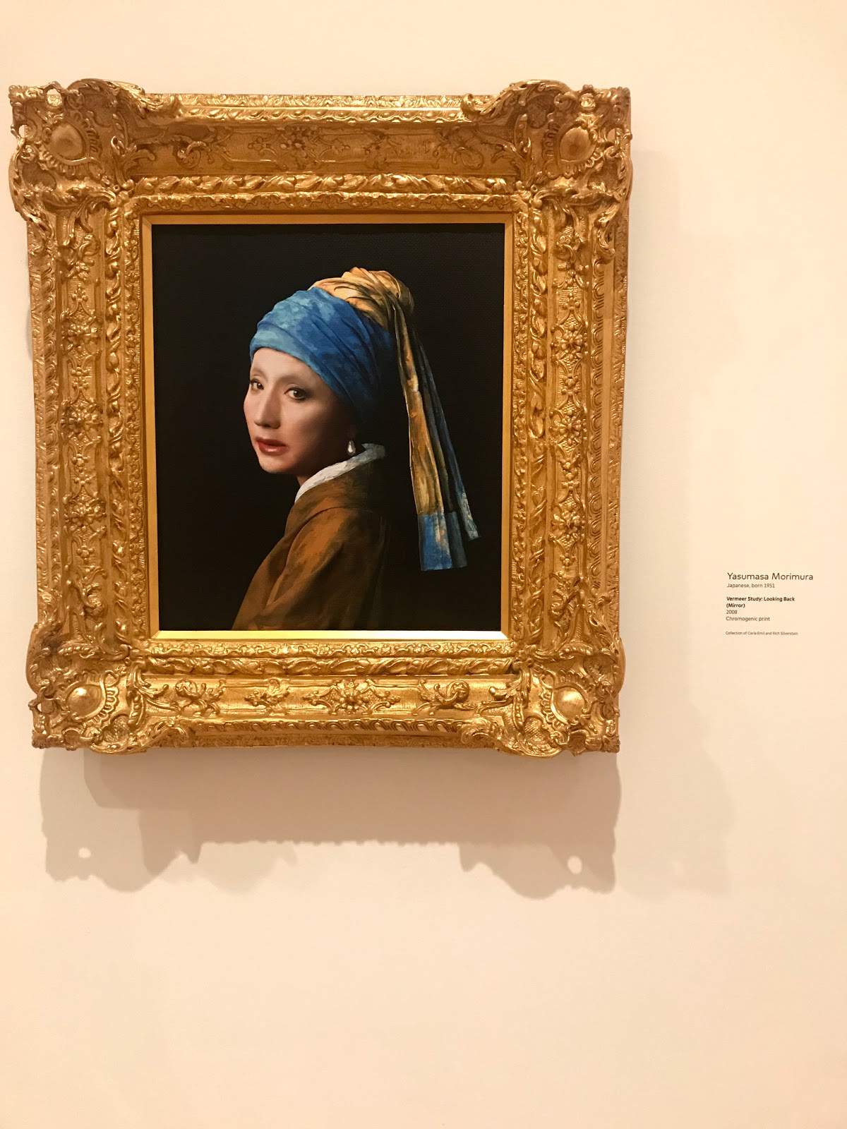 |
| Yasumasa Morimura's Vermeer Study: Looking Back (Mirror) |
We went to a photograph exhibit but we didn't have the time to immerse... the museum was closing and the audience was being herded out. And then there's the Magritte exhibit too. But we had to pay extra to see the paintings. I didn't want to spend extra on that though.
Oh well, there is always a next time. Three hours was definitely not enough to visit the SFMOMA.


Comments
Post a Comment
Thank you for dropping by!
Before moving on, please share your thoughts or comments about the post. :)
Thanks again!